Influenza Patterns in the U.S. (2009–2017): Preparing for Flu Season 💉🏥
Project Date: November 2024
Category: Public Policy & Infrastructure
Project Overview
Objective: Identify high-impact regions and time periods for vaccination and staffing campaigns by analyzing historical flu mortality trends.
Why it matters:
Flu response planning often defaults to uniform approaches. By uncovering regional and demographic patterns, we can target interventions more effectively — improving outcomes for vulnerable populations and easing strain on healthcare systems.
Data Sources:
- CDC Influenza Mortality Data (2009–2017)
- U.S. Census Population Estimates (2009–2017)
Methods:
- Data cleaning, integration, and normalization
- Correlation and regional trend analysis
- Tableau dashboards for visual forecasting
- Narrative design for policy and decision support
Deliverables:
TL;DR
- Flu deaths follow strong seasonal patterns with intensified regional concentration in the U.S. South.
- Adults 65+ make up only 10% of the population but account for nearly two-thirds of flu deaths.
- When normalized per capita, the ranking of high-risk states shifts dramatically — underscoring that vulnerability is not the same as risk exposure.
- A custom severity index (FSPI) and residual-based clustering revealed hints of systemic variation in how states absorb flu burden.
Recommendation:
Shift from broad strategies to contextualized response plans — factoring in population risk and healthcare system capacity.
Key Insights
1. Regional & Seasonal Patterns
Seasonality:
- Flu season peaks in winter, with occasional spring resurgence
- The Southern U.S. consistently shows the highest mortality rates

FIG. A: Average monthly flu deaths by U.S. region.
Note: Y-axis scaling may exaggerate differences—consider when interpreting.
2. Age-Related Vulnerability
Critical Insight: Adults 65+ represent ~10% of the population but account for ~66% of flu fatalities.

FIG. B: Population age distribution (left) vs. flu mortality age distribution (right).
Geographic Impact: States with larger senior populations show higher total flu deaths, highlighting a demographic risk layer.
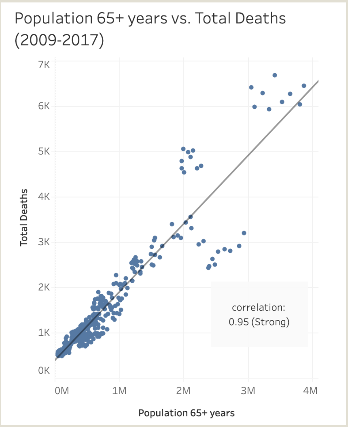
FIG. C: Scatterplot showing correlation between 65+ population and total flu deaths.
3. Population-Normalized Risk Analysis
Key Insight: High total death counts ≠ high individual risk.
Example:
California leads in total deaths but ranks low in flu deaths per 100K residents when adjusted for population.
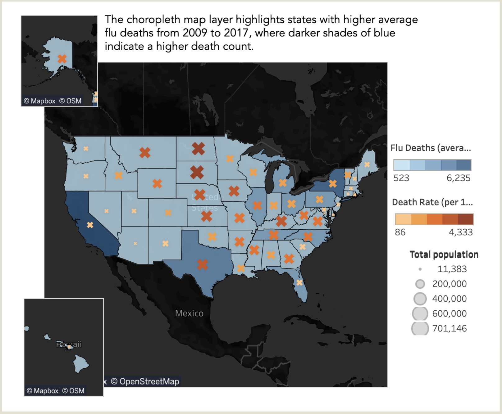
FIG. D: Choropleth of flu deaths per capita (shading), with symbol size showing total deaths. High population states like California appear lower-risk when normalized by population.
Implication: Effective resource allocation must weigh both absolute numbers and population-adjusted risk.
Bonus: Exploratory Modeling
1. Flu Severity Parsing Index (FSPI)
What It Is:
A custom metric to flag states where flu deaths among seniors (65+) are disproportionately high relative to overall mortality.
Formula:
FSPI = Death rate (65+) ÷ Overall death rate
Why It Matters:
In a typical system, seniors face higher risk—but extreme ratios may signal systemic strain, delayed care, or underserved populations.
How It Was Used:
- Mapped FSPI vs. 65+ death rate
- Analyzed residuals to flag overperformance or underperformance
Examples:
- Alaska shows the highest FSPI—indicating potential system strain
- Florida has high death counts but a low residual—suggesting stronger-than-expected performance
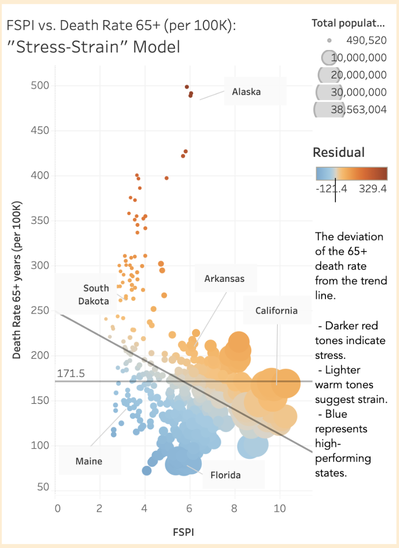
FIG. E: Scatterplot of FSPI vs. 65+ death rate. Alaska, Florida, and California stand out—but for different reasons.
Note: FSPI is a hypothesis-generation tool—not a forecast model. Based on 9 years of data per state.
2. Query Clusters
Approach:
Manual clustering in 2D feature space for interpretability.
Methodology:
- Plot FSPI vs. residual
- Size points by population
- Surface cross-regional groupings (e.g., high-density metro vs. rural profiles)
Innovation: Enables “informed random sampling”—a more nuanced alternative to basic geographic grouping.
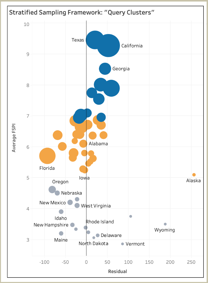
FIG. F: Average FSPI vs. Residual, sized by state population. Visual clusters suggest different structural profiles across states.
Recommendations
1. Synchronize National Vaccination Campaigns
Align campaign intensity with deaths per 100K residents. Prioritize the Southern region, which shows elevated total deaths and sustained monthly mortality.
2. Broaden Metrics Beyond Mortality
Incorporate metrics for hospital strain (e.g., patient volume, surge capacity). Target staffing not just where deaths are highest, but where systems are overwhelmed.
3. Refine Vulnerability Models
Factor in socioeconomic indicators (e.g., insurance coverage, income levels) alongside age. This enables a more equitable and effective resource allocation model.
Tools Used: Tableau, Python, Data Integration
Skills Demonstrated: Geospatial Analysis, Public Health Analytics, Custom Metric Development, Visual Storytelling